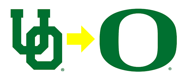
On Dec. 23, 1998—twenty-five years ago—the University of Oregon dropped the "Interlocking UO" logo from its everyday official usage and introduced the Nike O. The UO still is a secondary mark and is often used in "throwback" merchandise, though.
In terms of Oregon uniform tracking, that event was sort of like the change from BC to AD—"Before Nike" and "After Nike" if you will!
The 1998 season was the last of the old uniforms and the 1999 season was the beginning of the new Nike sets. At the December 1998 Aloha Bowl media event on Waikiki Beach, the public got their first look at the future uniforms. (but they did not wear them in the bowl game, which they lost again to Colorado)
In 2019, Goducks.com and Rob Moseley put out two detailed stories about that event:
"...the debut of the now-iconic "O" logo that has made the University of Oregon an international brand...was unveiled on Dec. 23, 1998, when the Ducks in coordination with Nike introduced new uniforms, school colors and the logo during the week leading up to the football team's Aloha Bowl appearance. But its genesis was more than two years earlier, in the wake of the 1995 UO football team's Cotton Bowl appearance. For UO alum and Nike CEO Phil Knight, it was the first game in which his alma mater was outfitted in uniforms supplied by the company he co-founded – but also it was the Ducks' second straight loss in a New Year's Day bowl game."
https://goducks.com/news/2019/8/15/general-oral-history-the-o-turns-20.aspx
https://goducks.com/news/2019/8/22/general-oral-history-the-o-turns-20-part-ii.aspx
As a Duck, and graphic artist, I have always been intrigued by their assertion that the 1998 O logo was created by "combining" the plan of their two then-stadiums: Hayward Field (before they demolished in 2018) and Autzen Stadium (before they made it lopsided by expanding south side in 2003)
Before the new O logo, the interlocking letters was a common way of making a college logo and therefore might be visually confused with other similar school like Oklahoma, USC and Utah among many others:
But going even farther, Oregon wanted to "Own the O" and with several other more well-known universities in states with an O-name, that was hard. Oklahoma, Oklahoma State, Ohio State and Oregon State all use more adorned Os. And luckily the others don't rely on a single O as their primary, and Oregon State uses their Beaver head most of the time:
Learn more about the current official usage of the O logo: https://communications.uoregon.edu/uo-brand/marks-logos/primary-logo
The irony is that we all look back to 1998s as the birth or the "Oregon Uniform craze" but in reality it was an-almost decade long birth of the trend that has swept college football the last 20 years:
 |
| Joey Harrington shows off the consistent home/way look of first seasons of the Nike rebrand. 1999-2002 |
- The 1999 uniform template was used for four seasons and was VERY consistent with green helmets and two jersey/pant combos.
- 2003 they piveted to a slightly more mix-and-match style by adding yellow back in. Four different combos.
- 2004: Five combos
- 2005, the first non-green/white/yellow jersey was introduced: black. Nine different combos.
- 2006, eight seasons of dark green helmets with an O came to end with the hated "grellow" helmet in the Las Vegas Bowl loss. Ten combos.
- 2007 with Chip Kelly's arrival as OC, the whole "Oregon Way" shifted to news looks each week a and introduced white helmets Twelve combos, with only one repeat.
- 2008: Black helmets added.
- 2009: The maturation of the "Oregon way" with pretty much every color used from here on out.


