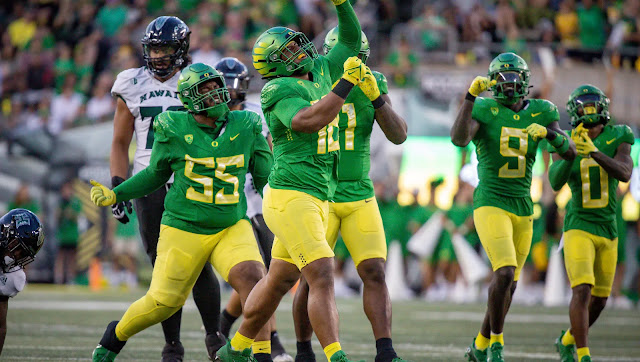
Eventhough I usually shy away from giving major opinions of the weekly combo worn by the Ducks, I am human and have my favorites, and least favorites. The last few years the Ducks have been pretty "normal" with the clothing choices (since their awful 2016 season) and there is rumor that 2024 will bring a new template for the Ducks after three seasons wearing the "diamond-plate meets wings" shoulder design.
See my spreadsheet of each week's combos here
So here is my wrapup of the 2023 season with my personal ranking of their looks this year:
14: Chrome/Eggshell/Eggshell week 7: It was a loss to UW, and eggshell is my least favorite look since the 2016 season of odd uniform mistakes. Chrome wings are not distinct enough—they just look chrome. I'd have at least used nightmare wings.
13: Chrome/Eggshell/Nightmare week 12: Only saved from last place by huge victory against ASU and less eggshell. Sunshine helped the helmets and shiny numbers look better than the UW game. But IMHO all three of these novelty (non brand) colors combined into one, are best worn in moderation, or not at all.
12: Black/White/Black week 9: Again, not much school color and too much black. Win at Utah, no eggshell, apple green numbers, make it marginly better than #13. The black/carbon helmets are not distinct enough—they just look black.
11: Chrome/Nightmare/Nightmare week 10: Win against Cal. Nightmare is at least "green" but has always been way too muddy/dark for my taste. Chrome and bright yellow details, at least saves it from mono-Nightmare.
10: Chrome/White/White week 2: The saving grace of these is they looked fresh and bright in the Lubbock sunshine against Texas Tech. I think the mostly white road uniform is quite nice in this template since it has apple green elements.
9: Apple/White/White Pac 12 Champ: Slightly better than #10 only because of the green helmet. Bad loss to UW again, otherwise this is a good road uniform.
8: Black/Yellow/Black week 11: I like the bumblebee look for the Ducks, but black is still NOT a school color so it falls below any uniform with yellow and green. But any uniform the ducks were to beat USC is good.
7: Black/Yellow/Yellow week 1: The mostly all-yellow is a bold statement. Not horrible, not great, just the middle of the field.
6: Black/Apple/Black week 4: Again, black is not a school color, but this combo works fine. And boy howdy was the Colorado game a media circus!
5: Apple/Apple/White week 13. Civil War deserved yellow pants, not white. Having white pants makes this look feel top heavy.
4: Apple/White/Apple week 5: This is an almost-perfect road uniform...only improvement might be yellow helmet?
3: Apple/Apple/Yellow week 3: What the #5 combo should have been.
1/2 Tie: Throwback Yellow/Apple/Yellow, week 8/Fiesta Bowl: Does anybody dislike this look? I'm not one who thinks we have to go back to this template full-time, but it needs to come out EVERY year for Civil War or some other historically important matchup.
You can probably tell that I like the use of both green and yellow in their Duck uniforms, since they were my top 3. And the uniforms that contain NO yellow OR green fall at the bottom of my list. And if I had to choose between matching jersey/pants and no matching I always got not matching.


